Navigator Highlights
Maker Log
Weekly examples of real user creations in SignalFlare's Navigator
Analysis
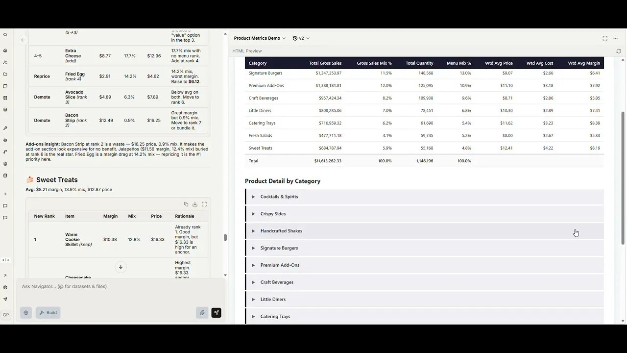
Gaurav demos how Navigator automates the menu mix and profitability analysis that usually kicks off a menu architecture project. One structured prompt: it pulls POS sales through the semantic layer, joins an uploaded cost sheet, cleans up the messy parts (missing costs, duplicate rows, data gaps), and returns a business-ready HTML report.
Hours of manual work, now under fifteen minutes — and a follow-up like "use incidence instead of quantity mix" is a one-line ask, not a data-team ticket.
SignalFlare ingredients:
POS sales via Navigator's semantic layer
Navigator's knowledge repository (cost lookup)
Restaurant-specialized sub-agents
A structured menu & profitability workflow
Generated interactive HTML artifacts
Map
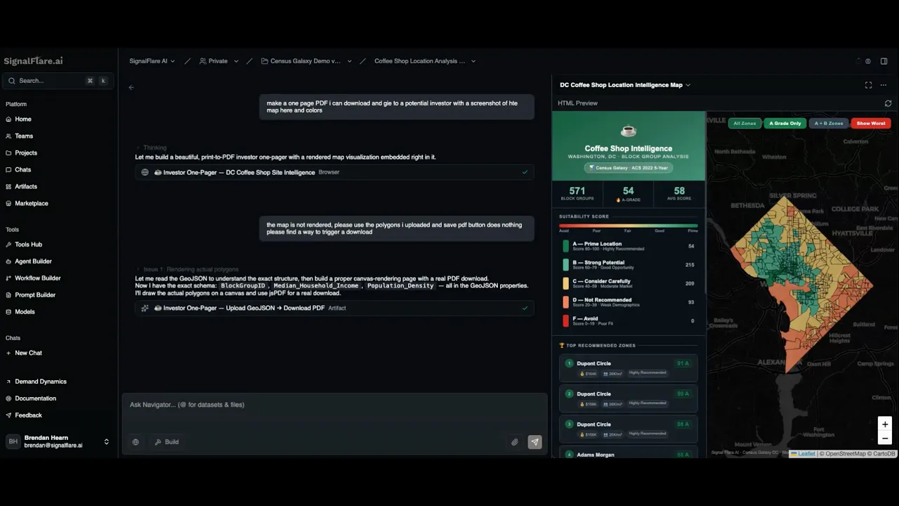
In this demo, Brendan shows how SignalFlare's Demand Dynamics data can be used in Navigator to generate a polished site selection artifact.
After adding GeoJSON and CSV files to the knowledge base, Brendan asks Navigator to analyze DC block groups and recommend strong areas for opening a coffee shop. Navigator produces an interactive map, ranks potential locations, and scores them using factors like median household income, population density, age groups, coffee shop frequency, and employment rate.
The result is a quick path from raw geospatial data to a business-ready output: a visual map, ranked recommendations, and an investor-style summary of the strongest locations.
SignalFlare's native ingredients that made this work:
Demand Dynamics data (census demographics, income, density, age, employment at the block group level)
Navigator's knowledge repository
Restaurant-specialized sub-agents
A location scoring workflow
Generated interactive artifacts
Analysis
Gaurav demos how Navigator automates the menu mix and profitability analysis that usually kicks off a menu architecture project. One structured prompt: it pulls POS sales through the semantic layer, joins an uploaded cost sheet, cleans up the messy parts (missing costs, duplicate rows, data gaps), and returns a business-ready HTML report.
Hours of manual work, now under fifteen minutes — and a follow-up like "use incidence instead of quantity mix" is a one-line ask, not a data-team ticket.
SignalFlare ingredients:
POS sales via Navigator's semantic layer
Navigator's knowledge repository (cost lookup)
Restaurant-specialized sub-agents
A structured menu & profitability workflow
Generated interactive HTML artifacts
Map
In this demo, Brendan shows how SignalFlare's Demand Dynamics data can be used in Navigator to generate a polished site selection artifact.
After adding GeoJSON and CSV files to the knowledge base, Brendan asks Navigator to analyze DC block groups and recommend strong areas for opening a coffee shop. Navigator produces an interactive map, ranks potential locations, and scores them using factors like median household income, population density, age groups, coffee shop frequency, and employment rate.
The result is a quick path from raw geospatial data to a business-ready output: a visual map, ranked recommendations, and an investor-style summary of the strongest locations.
SignalFlare's native ingredients that made this work:
Demand Dynamics data (census demographics, income, density, age, employment at the block group level)
Navigator's knowledge repository
Restaurant-specialized sub-agents
A location scoring workflow
Generated interactive artifacts